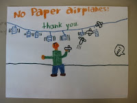
RULES Rule!
At the beginning of each school year, students hear the rules over and over and over… By the time they see me, they’ve heard it about a dozen times. I started to think of creative ways to get them to hear the rules and get in some Art those first days of school.Each year, one of my first projects with my 3rd grade students is “Rules Posters.” I tell them that this is a very important job, and that they have been chosen to do this because they have been around long enough to know and understand the rules and their drawing skills are awesome at age 8!
I have a SMART lesson comparing and contrasting posters. We start with the US Constitution and the Art room constitution. I ask them “Which one is more interesting, and why?” Kids usually say our school’s is better because the letters are big and there’s color.
Next, we take the US constitution and compare it to an “old fashioned” black and white newspaper, asking them again “Which one is more interesting, and why?” Again, the kids will often say “The US is small and in cursive and hard to read. The newspaper has big letters-some of them fancy- and that gets my attention.”
Lastly, we take the black and white newspaper and compare it to a 1998 State Fair poster, again asking “Which one is more interesting, and why?” Students say they like the State Fair poster because it has color and pictures on it.
We talk about what makes a good poster: color, big letters and a picture.
Students use 9”x12” white drawing paper, pencils, and markers and think about the concepts of Color, Big Letters, and Pictures to design a Rules Poster to be hung in the Art room for the entire school year. They have an immediate sense of pride for their posters and point them out to others throughout the school year!


No comments:
Post a Comment